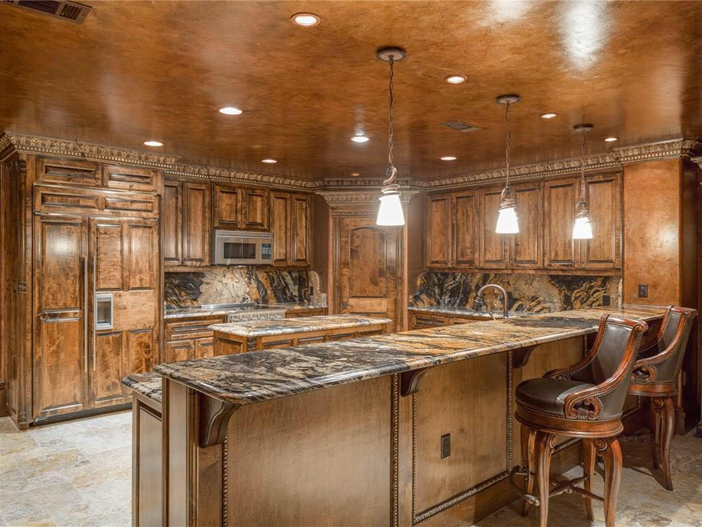
Your Custom Kitchen Doesn’t Have to Default to White Materials
The guiding design principle for most kitchens is to use light colors. Light countertops and backslashes look cleaner. They also make small, cramped nooks look bigger. The logic also goes that kitchens and bathrooms need to have similar design theme: if your bathroom has to have white tile and light fixtures, so does the kitchen.

But when you’re building out a custom kitchen in the house of your dreams, you don’t have to follow those old guidelines. Here’s why:
Design the kitchen to get the natural lighting you want.
Kitchens (and bathrooms) look cramped and dim because they don’t get much natural lighting in the majority of home floor plans. So talk to your designers about making sure your kitchen has natural light and windows in every direction. Open floor plans light up your kitchen with sunlight from multiple exterior walls. If your kitchen is in the corner of your house, you can a glass patio wall on one side and a window above the sink on the other wall.
Focus on textures and details, not just the color palette.
If you want to keep your kitchen consistent with other rooms in the house, that doesn’t mean all of the colors need to match. Get the leather-textured countertops or the navy cabinets you want. But give the handles and hardware the same metallic finish throughout the house and pick cornice or wainscoting options that match in different rooms.
Get rid of the space limitations that narrow your design options.
It’s not just a lack of natural lighting that makes most home renovations turn the kitchens white or bleached out. Small kitchens often need light colors so the overhead cabinets and light fixtures don’t make people feel too claustrophobic. If you want dark colors, design a wide kitchen along one wall with a good kitchen island. All of that open space means you get to pick every color without restrictions.
Browse our gallery or talk to our design team here at J. Lambert Custom Homes.
